Tiny Internet Package | Live product
Bringing the feeling of handmade gifts online
- Role
- Product Designer & Builder
- Team
- Solo
- Timeline
- 2026
- Status
- Live Web Product
- Skills and Tools
- Product Design, Interaction Design, Design System, Development, Claude Code
- Opportunity
- Help long-distance friends make something personal for each other, with the making, wrapping, and anticipation of a handmade gift.
- Contribution
- I owned the concept, product decision, visual design, development and marketing.
- Result
- 70.5K+ parcels made.
- 1,036,587 page views
- 30% bounce rate.
Solution
Make a keepsake, then send it as a link.
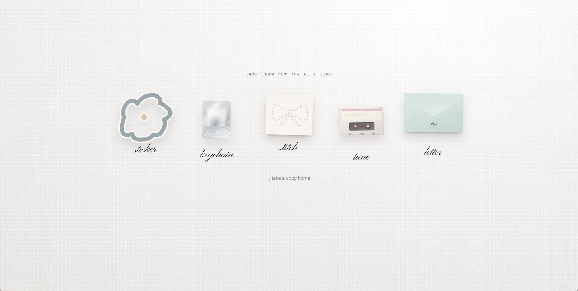
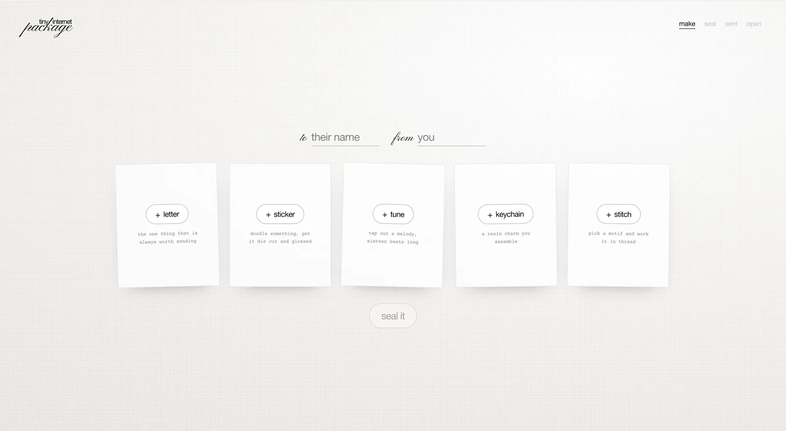
The digital gift maker lets people write a letter, draw a sticker, tap out a tune, assemble a keychain, or make a cross-stitch design. Each parcel can hold one of each craft, and the sender chooses which to include.
Making the gift
Receiving the gift
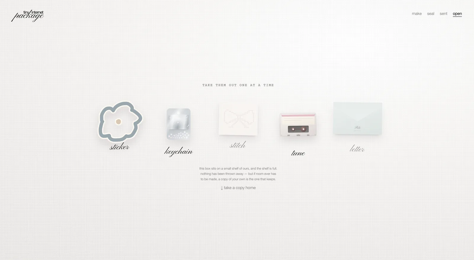
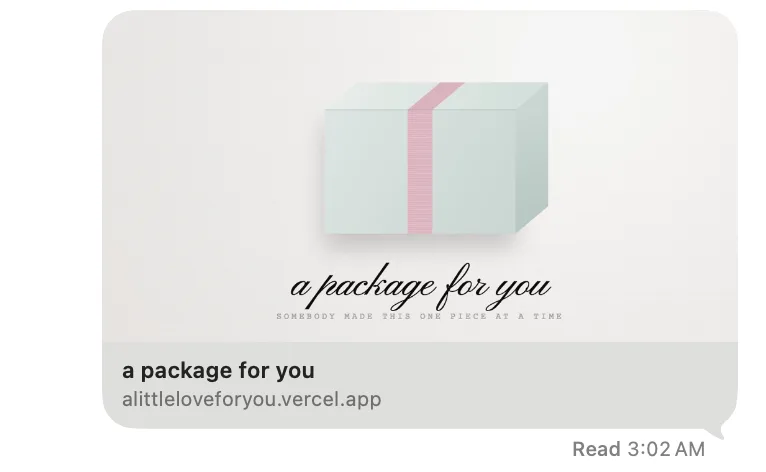
They add names, choose the wrapping, and seal the parcel, then share its link in an existing conversation. Their friend arrives at a sealed parcel addressed to them, opens it, and takes out the keepsakes one at a time.
The idea
From a care package to something you make for a friend.
I started with the idea of a virtual care package, but that felt too generic. I wanted the sender to have a hand in making what went inside, choosing the words, colours, and details with a particular friend in mind.
The challenge was giving people enough freedom to make the gift their own, with enough guidance to help them finish it.
I also needed to consider the person receiving it: how would they open and explore something their friend had made? How could a handmade feeling be captured digitally at all?
Product Decision 1
People get stuck when they're given a blank page.
To help people get started, I added a guide for some of the more difficult crafts to include in their parcel.
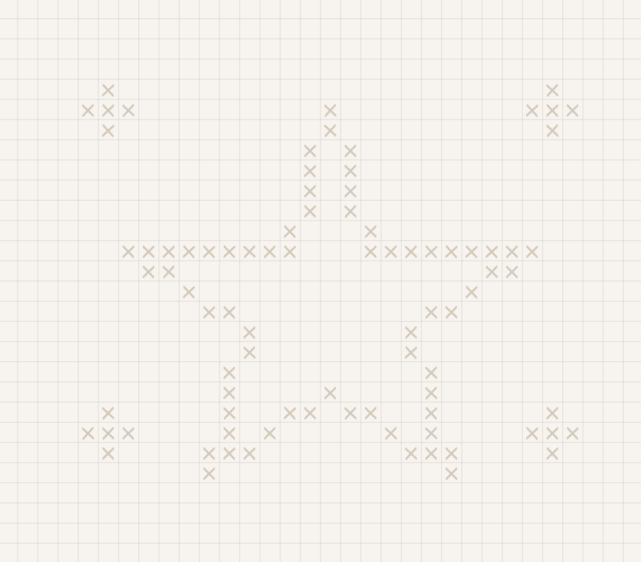
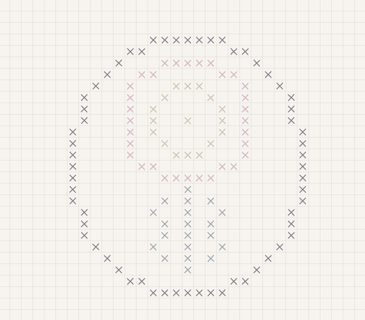
Cross-stitch maker. I added a couple of preset shapes so someone who didn't know what to make could start with a suggestion and change it as they went.
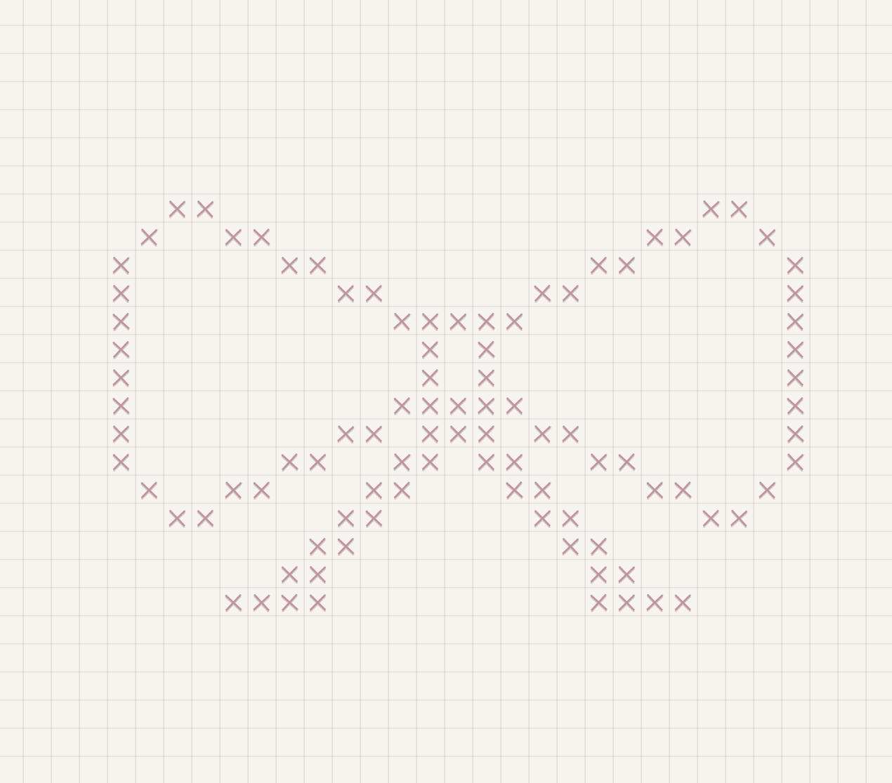
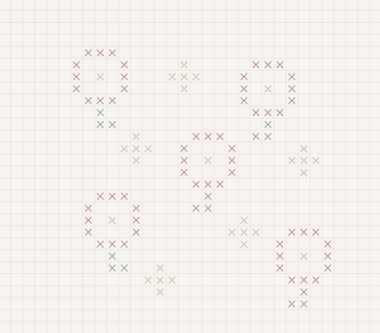
Tune maker. I also added preset tunes, limiting the available notes to ones that sounded good together, so people could choose their own sequence without needing to understand music theory. Unmute the clip to hear it play.
Colour. I applied a similar constraint to colour. Customization stayed within a shared palette so people could make different choices while the crafts still looked cohesive when packed together.
Product Decision 2
Let people change their minds while making.
The first cross-stitch flow had no way to go back and edit. I wanted people to focus on making the gift and commit to their choices as they went, treating mistakes as part of the handmade charm.
Pro: It evoked the same feeling of handmade I was going for, committing to a stitch the way you would with a real needle and thread.
Pain point: A small mistake could leave someone frustrated with a gift they were making for a friend. I tested the flow with a group of users: four of five disliked it and said they'd rather restart completely than fix a mistake.
So I changed the flow to allow editing. People could try an idea, reconsider it, and keep working toward something they wanted to send.
For removing something they'd already added, I tried a few approaches: clearing everything at once, letting people tap directly on the stitch they wanted gone, capping removal at a fixed number like six, or dragging across several stitches to remove them together. I tested each approach with the same group of users to collect feedback.
One tap empties the whole swatch.
8 stitches placed.
Tap any stitch directly to remove that one.
8 of 8 stitches left.
Same undo, stopped after six removals.
6 removals left.
Drag across stitches to remove several at once.
8 of 8 stitches left.
Dragging to remove multiple stitches at once won: it let people clear a mistake as fast as they'd made it, without wiping the whole swatch or tapping out each stitch one at a time.
Product Decision 3
Make the digital objects feel worth playing with.
I wanted the keepsakes to invite interaction after they were made.
Keychain. For the keychain, people could customize it, then poke or shake it on screen. The movement gave them another way to explore an object they could never physically hold.
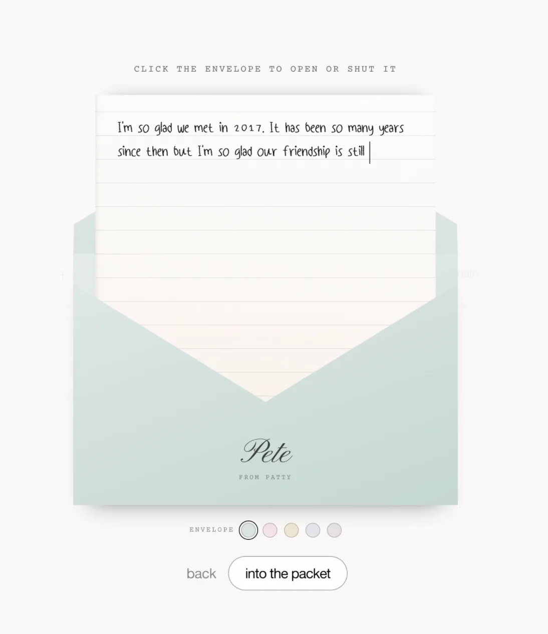
Letter. I turned my own handwriting into a font. I designed the letter so the paper looks real, and gave it an open-and-close interaction.
Viewing the gift. For the drawing and the cross-stitch piece, opening a keepsake replays how it was made instead of showing the finished result right away: the doodle's strokes draw themselves in, and the cross-stitch pattern builds in the same sequence the sender worked through. The recipient watches it come together and sees the effort that went into it.
Watching a keepsake come together
Product Decision 4
Print how long the gift took to make.
After sealing, senders can get a printed receipt showing how long they spent making their gift. It's a small way to make that effort visible, since sending something over the internet otherwise hides it completely.
The printed receipt that shows your effort
Outcome
1M+ page views, 200K+ unique visitors, 70.5K+ parcels made.
An Instagram post about the product separately reached over 500,000 views.
A 30% bounce rate is relatively low, meaning that most visitors stick around instead of leaving right away.
- 70.5K+
- parcels made
- 1,036,587
- page views
- 30%
- bounce rate
The best part has been learning that the care that went into making something came back as real joy on the other end.
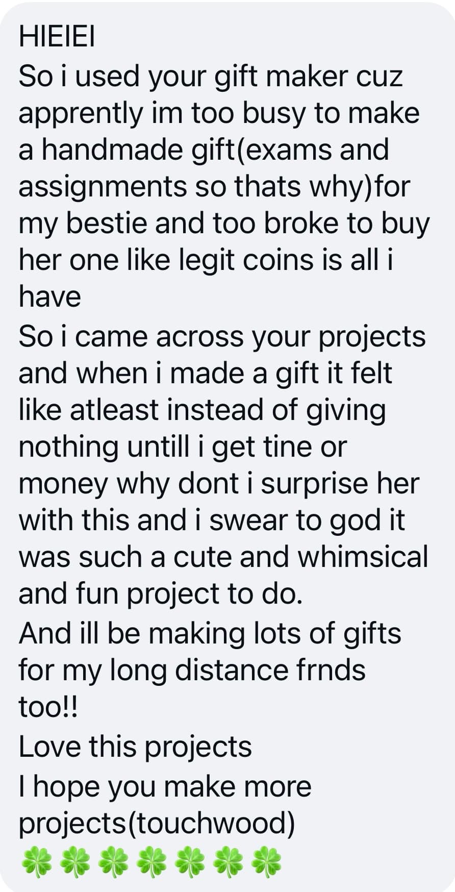
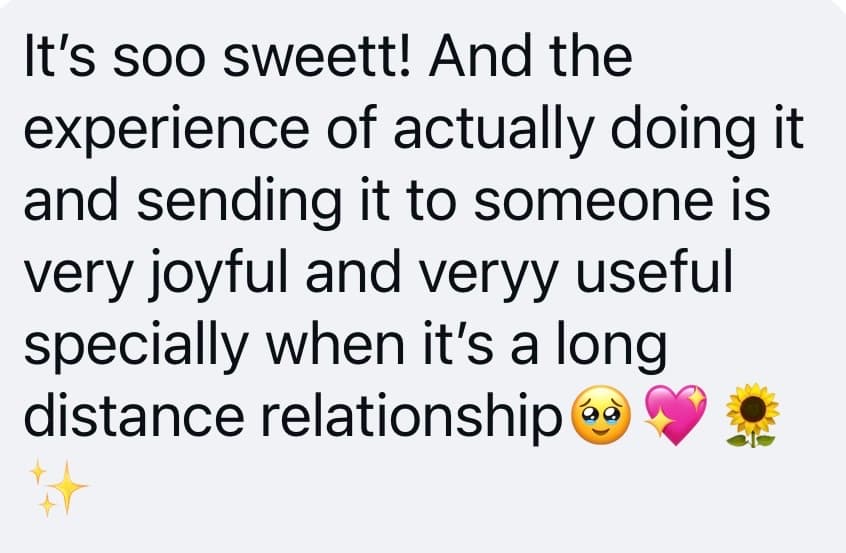
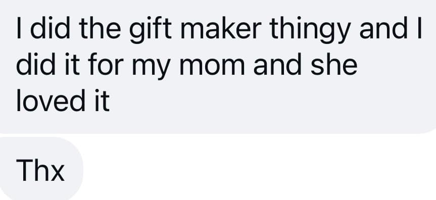
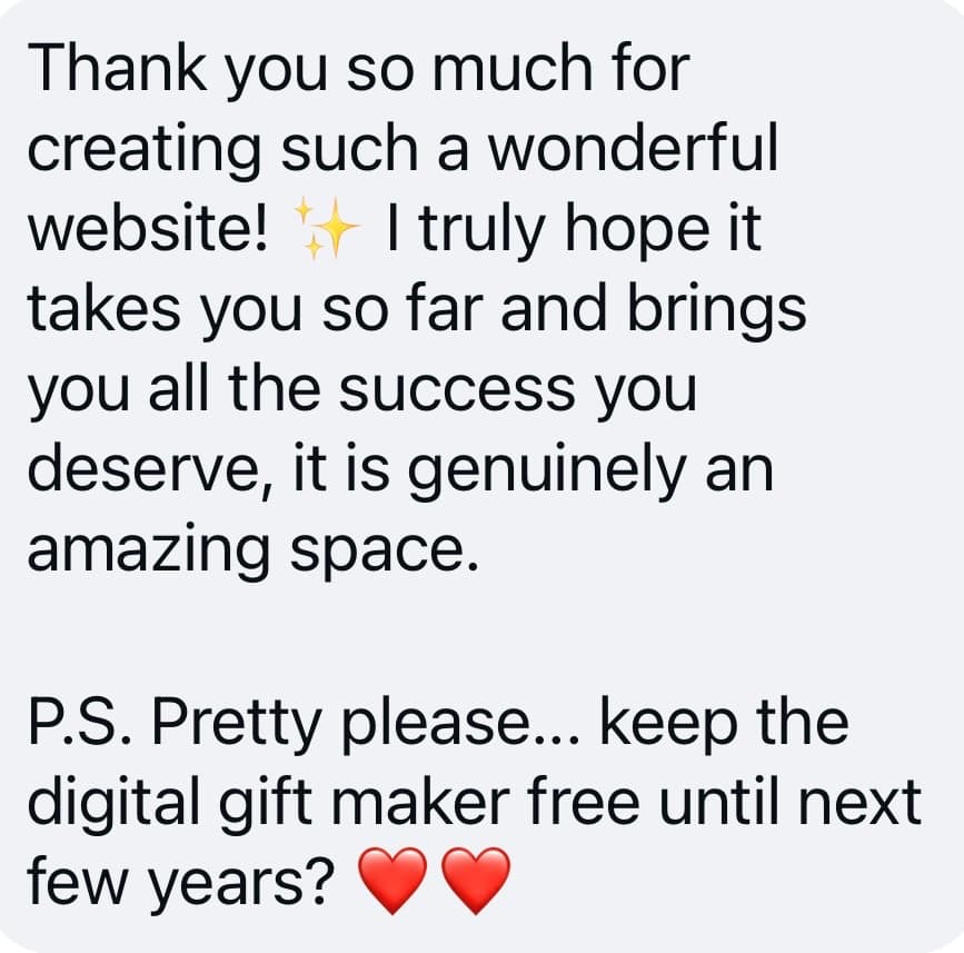
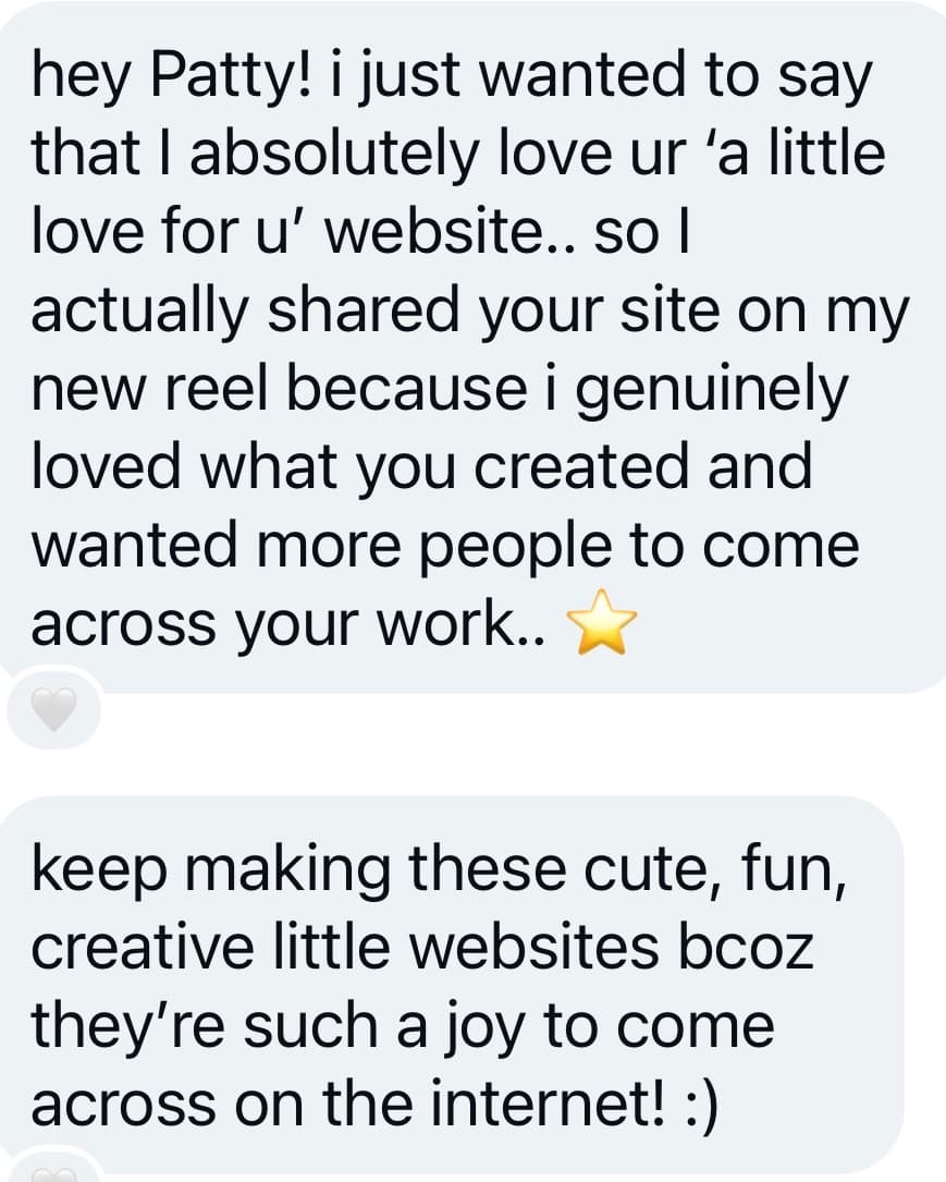
A few of the messages I've received - there are many more!
What I learned
Building this taught me how much work happens after design.
The handmade feeling came from lots of tiny choices. I had to think carefully about the smaller interactions because they shape how the whole experience feels. Without them, it could easily become just another virtual care package. From making each step feel pleasant to deciding how a keepsake opens or responds, the details are what gave the product its personality.
I also learned what it takes to keep a real product running. I added rate limits and cost guardrails so a traffic spike couldn't take the site down or leave me with a huge bill. Privacy also became part of the product thinking, so shared parcel links use long, unique URLs that are difficult to guess. As the project reached far more people than I expected, these decisions started to matter much more than they did when I first built them.