

APSC brand hub | Shipped 2025
Designing navigation across two brand platforms
- Role
- UX Designer
- Team
- 2 UX Designers
- Timeline
- May - August 2025
- Status
- Shipped
- Skills
- User ResearchInformation ArchitectureUsability TestingContent Strategy
- Problem
- Communicators needed brand assets under a deadline. Guidelines and templates were split between the public brand hub and intranet. Broad labels and long pages made them hard to find.
- Contribution
- I led the UX redesign: restructuring the public brand hub's navigation through tree testing, then rebuilding the intranet around units through end-user interviews, with the Comms and Digital teams.
- Result
- Clearer navigation on the public brand hub
- Unit-first intranet paths, with navigation reduced from 11 items to 8
- Shipped for 20+ communicators across four units
Solution overview
Help communicators choose a path before facing the whole library.
I redesigned two separate platforms: the public brand hub for brand guidelines, and the internal intranet for unit-specific templates and resources.
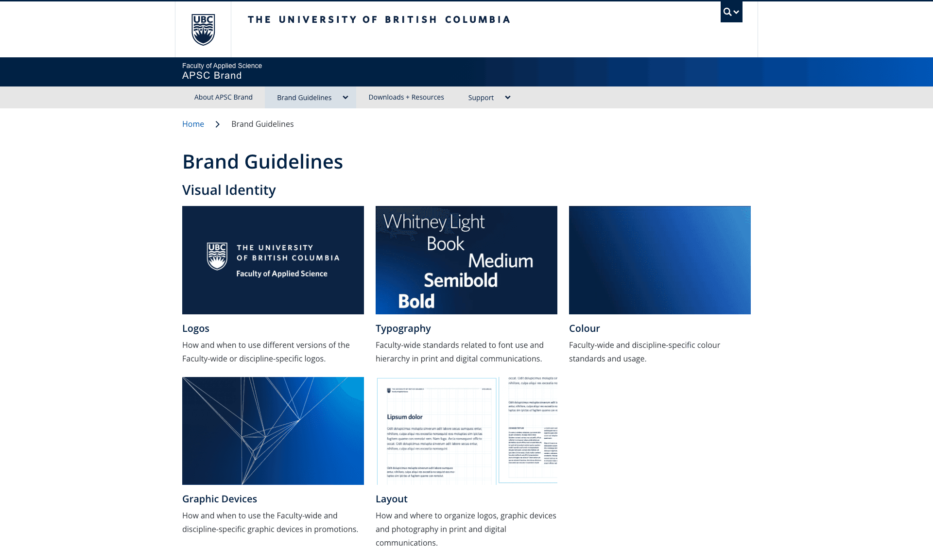
The public brand hub. I restructured the navigation and added section landing pages. I also introduced quick links for scanning and grouped content by unit.

Solution 1: Navigation restructured
The internal intranet. I introduced Browse by unit and Most used entry points so communicators could find relevant templates before scanning the full collection. I also simplified navigation.


- Reduced top-level nav
- Merged and removed redundant pages
- Standardized naming conventions
- Restructured around two entry points
- Added sub-pages where needed

Solution 1: Regrouping resources and standardizing names
The problem
The resources were there. A clear path through them was missing.
Early feedback showed that communicators scrolled past useful content and downloaded assets without finding the guidelines. This led to off-brand materials that the Comms team had to review and help correct.
Different access rules ruled out combining the public site and intranet. I needed to improve the paths through both while keeping them manageable for the teams maintaining them.

One journey across the public site and intranet
Content audit
Start with the files people came to find.
I mapped pages to tasks and used page-visit data to prioritize templates, logos, photography guidelines, and onboarding resources in the navigation.
The tension I had to work with: admins wanted to show the whole collection, while communicators wanted only the resources relevant to their work.

Content audit

Old user journey: from searching for an asset to asking Comms for help
Public Brand Hub
Part 1 of 2Public site · Tree testing
Test the journey and the wording before designing the pages around them.
I used post-its to test four retrieval tasks: finding a template, photography guidelines, a SALA logo, and onboarding resources, aiming to understand how they browse and find resources. I revised the hierarchy and labels eight times based on wrong turns and stakeholder feedback. The final structure separated broad categories from individual resources.
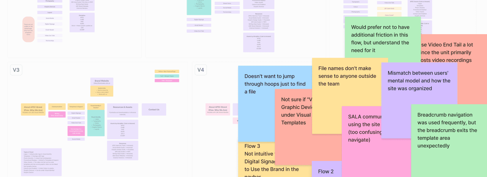
Tree-testing feedback: V3 to V4 sticky notes
Admins completed all four tasks. This supported the structure for maintainers, but left the labels untested with communicators from other units. Retesting would have delayed launch, and the site would be live for new communicators regardless, so I shipped on the admin-validated structure and planned to revisit it against real usage data.
- Who We Are: The About page was nested under the guidelines.
- Resources: Some resources linked to PDFs rather than following the page pattern used elsewhere.
- Digital Signage: These pages were only visible in the dropdown, not on the landing page.


Version 0: One broad label hid different tasksAbout, brand voice and asset guidance all sat under ‘How to use the brand’. Some pages were visible only in the dropdown, and resource links led to PDFs.
Intranet
Part 2 of 2Intranet · End-user interviews
Communicators looked for their unit. APSC felt like somewhere else.
Having just seen that admin-only testing left a gap on the public site, I pushed to test with end users first this time: task-based interviews directly with communicators from CHBE, SALA, SCARP, and the Dean’s Office, before the team settled on a structure. People relied heavily on Ctrl+F to find files in its overlapping categories.
Several identified with their school, department, or office. They read APSC as the faculty-wide organization and assumed resources under that label might not apply to them.
After these interviews, I added Browse by unit so communicators could choose their school or department and see the templates available to them.

Organization Structure
Key changes · Intranet
A clearer path to the right files, with room for the collection to grow.
The interviews shaped four changes to the intranet, shown below: simplified navigation, clearer labels, and two new starting points — Browse by unit and Most used. Communicators needed quick access to files for their unit; admins needed one collection they could maintain.
Change 1: Navigation reorganized, 11 items to 8
What shipped
Two reorganized platforms and a structure the team could maintain.
The redesigned public site and intranet paths shipped for an audience of 20+ communicators across four units. Intranet navigation went from 11 items to 8.
These are structural results. Given more time, here is what else I would look at to measure success:
Support requests. I tracked Comms team requests related to finding assets before and after launch: a 30% decrease so far. That's a short window, though, so I'd want to keep tracking before treating it as conclusive.
Find-time. Repeat the same retrieval tasks from testing before and after launch, to see whether people find files faster.
Consolidation holding up. Check whether the 11-to-8 navigation and merged categories stayed that way as the Comms and Digital teams added resources.
What I learned
The intranet got the test the public site didn’t.
Know how to adapt within real constraints. The public site only got tested with admins because of our timeline. I knew that was a gap, but there wasn’t time to go back before launch, so I planned to revisit it and track key measurements to guide future iterations.
Apply the lesson while it’s still avoidable. When I moved onto the intranet, I pushed to test with communicators before we settled on a structure. That helped surface insights we might not have caught otherwise.